
Finding the right cushion and bedspread colour combination can transform a bedroom from ordinary to beautifully cohesive. While many people struggle to get it right, the secret is understanding colour relationships and texture interplay — not guessing.
This practical guide shows you how to match cushion covers with bedspreads using real textiles from Kolka’s artisan collection, so your styling feels intentional, balanced, and visually pleasing.
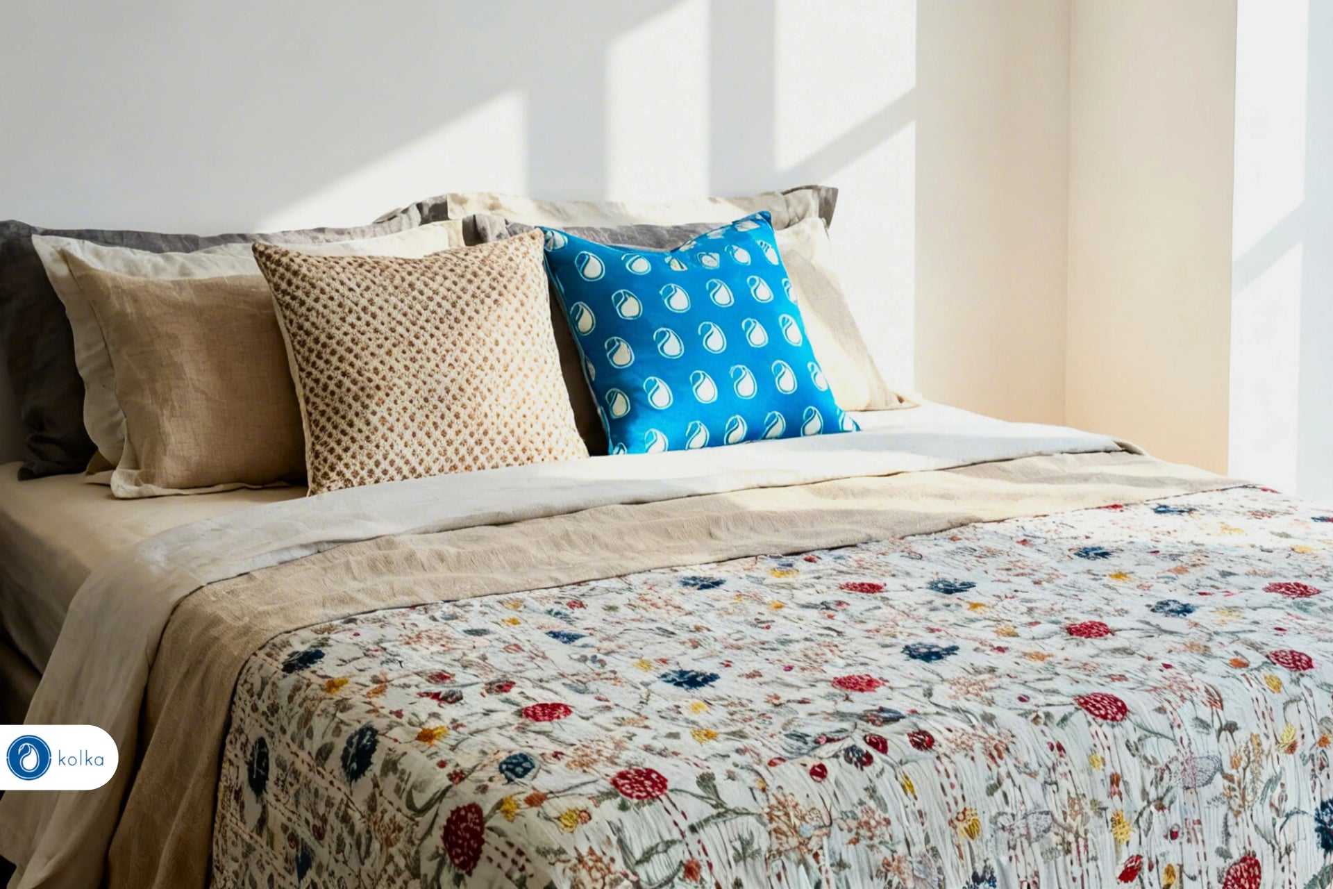
Choose a Base Bedspread to Define Your Palette

Your bedspread is the largest textile in the room — it sets the visual tone.
Option 1: Classic Neutral Kantha Bedspread
Start with a calm yet elegant base like the Belle Stripe Monochrome Kantha Bedspread | 220 × 270 cm. Its subtle stripes and monochrome palette make it a versatile anchor for both bold and soft accent colours.
This neutral foundation allows you to pull colours forward without overcrowding the visual space.
Complement with Coordinating Cushions
For this bedspread:
-
Add contrast with a pop of deep tone like the Botanic Lines Cushion Cover | 50 × 50 cm — the botanical green stripe brings fresh energy without clashing.
-
Balance with soft neutrals such as the Colva Neutral Cushion Cover | 60 × 60 cm for a laid-back, cohesive look.
These choices keep the palette controlled while introducing visual interest.
Contrast Bold Bedspread Colours with Subtle Cushions

Bold or richly patterned bedspreads need calm companions.
Take something like the Berries Kantha Bedspread | Green Bedspreads 220 × 270 cm — its rich green tones can easily dominate a room.
Cushions That Complement Bold Bedspreads
To balance:
-
Use a simple & elegant neutral cushion like the Kolka Beige Floral Decorative Cushion Cover | 60 × 60 cm Euro Sham to soften the overall look.
-
If you want an accent, a contrasting pattern such as the Blue Decorative Cushion Cover | 50 × 50 cm works well against green because cooler blues temper warmer greens.
This approach ensures your bedspread retains its vibrancy, while cushions enhance — instead of overpower — the colour story.
Use the Interior Designer’s 60–30–10 Rule
A design classic, this rule helps ensure your colours feel intentionally layered:
60% bedspread colour → dominant tone (e.g., green from your bedspread)
30% cushion tone → secondary supportive colours
10% accent shade → small decorative emphasis
For example:
-
60% from the bold Berries Kantha Bedspread
-
30% neutral from Colva Neutral Cushion Cover
-
10% accent from Blue Decorative Cushion
This balance avoids visual overload and helps each element breathe.
Mix Textures to Enhance Colours
Colour matching isn’t just about hues — it’s also about how fabrics interact with light and texture.
Pair soft cotton bedspreads with tactile cushion covers like jute or woven patterns to add depth.
For example:
-
The Bedspread acts as your colour stage
-
A botanical stripe cushion introduces organic lines
-
A neutral cotton cushion creates a calming effect
Your colours will appear richer because textural contrast creates subtle shadows and highlights.
Seasonal Touches Without Changing the Palette
Instead of replacing heavy textiles each season, use cushions to adjust mood.
Summer palette:
-
Light linens and whites
-
Green and blue accents (e.g., Botanic Lines Cushion Cover)
-
Airy cotton textures
Cooler months:
-
Deep neutrals
-
Subtle warm accents
-
Cushions with richer weaves
Swapping cushion covers is easier and more cost-effective than changing bedspreads.
Mistakes to Avoid When Matching Colours
Even a great design can fall apart without focus. Avoid:
✔ Using too many unrelated shades
✔ Ignoring texture — flat colours can look lifeless
✔ Choosing identical colours — contrast creates depth
✔ Cluttering with too many cushions
Aim for clarity in your base tone (bedspread) and intention in your accent tones (cushions).
FAQs
1. What colours match a green bedspread?
Neutral tones like beige or soft earthy accents work well, along with cool blues or whites to balance vibrancy.
2. Can I mix bold patterns with striped bedspreads?
Yes — but keep the cushion pattern scale smaller than the bedspread’s print to prevent clashing.
3. How many cushions should I use on a bed?
For a balanced look, 3–5 cushions are ideal: two larger anchor cushions, one accent, and one or two textured pieces.
4. Should cushion covers exactly match the bedspread?
No — aim for colour harmony rather than exact matching. Complementary or neutral shades create depth.
5. What cushion colours make a room feel bigger?
Lighter neutrals like beige, cream, or pale grey reflect light and visually open the space.